Gathered Grounds Coffee
-
Organic Coffee
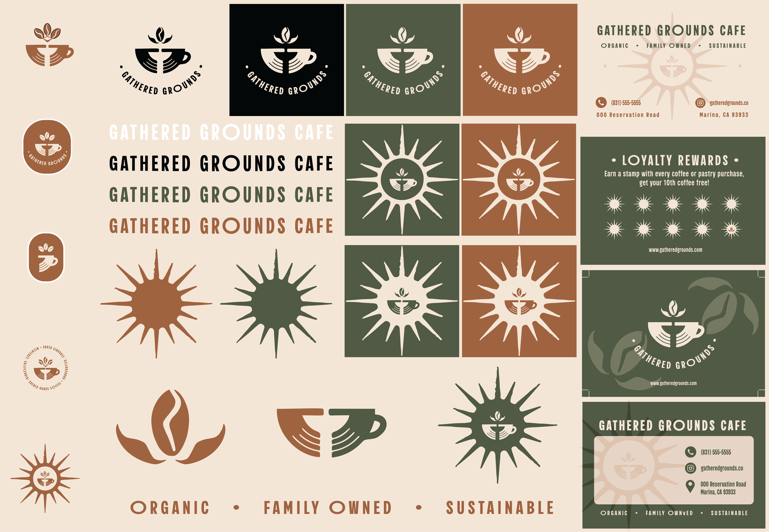
This brand wanted to have an aesthetic that is representative of their organic coffee. The color palette used were earthy greens, browns, and oranges to be representative of the colors seen in nature.
-
Family Owned
The coffee cup was designed with two hands to symbolize both the name and that this is a family owned and ran coffee shop. It brings a sense of grounded-ness and connection to the design. It is also emphasized on the business card designs .
-
Sustainable
With the color and design being reflective of nature (sun symbol, hand symbol, coffee ground plant symbol), it was also meant to have a sustainable aesthetic that matches the business practices. The sun and coffee plant designs attribute to the organic inventory and sustainable practices.
Initial sketching
The sketching first started off with a coffee mug that evolved into the hands as the coffee mug. I also wanted to incorporate the coffee bean plant as the steam somehow.
Initial Iterations
I wanted the logo to work in multiple different shapes as well as be able to stand alone. The font is called Salo and it gave it a nice, handmade feel to the logo. It is also readable and clean.
Final Logos
These are the final cleaned up logos. I changed the coffee bean shape from the initial iterations to be more simple and include a leaf design. The sun with the hands are transparent and can work on any color background.
Business Cards
I played on the logo shapes of the coffee bean and the sun. While I wanted to maintain the readability, I also wanted there to be visual interest. Thinking of functionality, I made the business card into a loyalty rewards card that people could also use. This gives the business card a bit more use past providing business information.


